
How to Capture Authentic Fashion Editorial
Table of Contents
- What Makes a Fashion Editorial Authentic
- How to Style a Fashion Editorial Shoot
- Fashion Editorial Photography Posing Guide
- Fashion Editorial Shot List Template
- Planning Location, Lighting, and Art Direction
- Building Your Editorial Photography Portfolio
- Post-Production and Color Grading for Editorial Impact
- Frequently Asked Questions
Last Updated: September 23, 2026
What Makes a Fashion Editorial Authentic
Authentic fashion editorial captures real emotion and movement through carefully constructed spontaneity, not candid photography, but strategically guided direction that appears undirected.
Authenticity vs. Staged Perfection: The Technical Differences
Staged editorial prioritizes symmetry and perfect alignment, creating polished but hollow images where the viewer senses control rather than genuine connection.
Authentic editorial prioritizes asymmetry and natural weight distribution, weight shifts between frames, expressions change, shoulders drop unevenly, signaling genuine movement rather than performance.
Key technical differences: Authentic editorial features evolving expressions and shifting hand placement (not locked poses), natural fabric interaction with dynamic drape, and directional lighting with dimensional shadows, all signaling genuine movement rather than held performance.
How to Direct Authenticity on Set
Authentic editorial requires more direction, not less, creating conditions where natural moments emerge, then capturing them with precision.
Establish a clear narrative before the shoot: not “we’re photographing a dress,” but “we’re showing how this dress transforms confidence” or “we’re capturing discovery of unexpected versatility.” This narrative guides every direction.
Direct through action, not position. Instead of “stand with weight on your right leg,” say “walk toward the window and pause when you feel the light change.” Action-based direction produces natural poses because the model focuses on movement, not position.
Use sensory language to prompt genuine expression: “What does this fabric feel like?” “Show me the moment you realize how this fits.” “Move as if you’re alone.” These prompts remove performance awareness.
Watch for tension indicators, shoulders creeping up, jaw clenching, hands gripping fabric, which signal performance rather than inhabition. Pause and reset: “Breathe. Relax. Move again.”
Set up the right conditions, lighting, wardrobe, location, narrative, then let the model move naturally. Your job is catching moments, not creating them. Keep your camera ready between formal shots; strongest images often appear when the model thinks you’re not shooting.
Authentic editorial requires a model who understands the difference between posing and inhabiting. During casting or pre-shoot conversations, ask models to show you how they’d move in a piece rather than how they’d pose in it. This distinction reveals who can deliver authentic editorial versus who defaults to commercial posing.
How to Style a Fashion Editorial Shoot
Strong styling carries weak shots; poor styling undermines perfect photography.
Understand the collection’s visual narrative, dominant colors, featured fabrics, mood, so styling decisions reinforce the story.
Building Your Mood Board and Visual Narrative
Build a mood board gathering inspiration from editorials you admire, color combinations, fabric textures, and jewelry styles. This becomes your creative north star during the shoot.
Your visual narrative connects all shots, showing how the dress moves through light, drapes on the body, transforms the wearer. Communicate this narrative to your team before the shoot so models and stylists understand the story.
Selecting Fabrics, Textures, and Color Palettes
Fabric choice affects how the collection photographs: heavy fabrics create bold silhouettes, lightweight fabrics flow dynamically, textured fabrics catch light differently. Consider how pieces read in photographs, a dress might photograph flat if the color blends with skin tone, while textured jackets become focal points under right lighting.
Color palette decisions matter: complementary colors create tension, monochromatic palettes feel cohesive, contrasting accessories draw the eye. Texture adds dimension, silky fabric next to knit creates contrast and tells a story about versatility.
The strongest editorial shoots feature 2-3 dominant colors and 3-4 key fabric textures. Anything more becomes visual noise.
Fashion Editorial Photography Posing Guide
In editorial work, you’re inviting viewers into a moment, not selling a product. Authentic poses feel natural even when carefully directed, hand placement, gaze direction, and movement determine whether the image feels staged or genuine.
Directing Models Without Rigidity
Give direction through a framework that allows freedom. Instead of “stand with left foot forward,” try “walk toward the light and pause when you feel warmth.” Explain you’re seeking movement and genuine expression, not rigid poses. Tell the story: “You’re discovering this dress for the first time.”
Direct through questions: “What does this fabric make you feel?” “Show me how you’d move in this piece.” Watch for tension in shoulders, jaw, and hands, encourage breathing, relaxation, and movement between shots rather than static poses.
The best editorial moments often happen between takes. Keep your camera ready. Some of the most authentic expressions appear when the model thinks you’re not shooting.
Capturing Movement and Candid Moments
Movement brings editorial photographs to life. A static pose can feel flat. Movement through space, fabric in motion, hair catching light, these elements create visual energy.
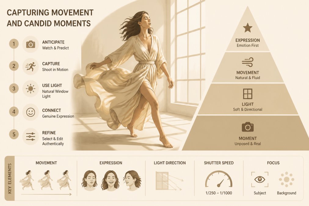
Direct movement with intention. “Walk toward the window.” “Turn slowly and let the fabric follow.” “Run your hand through your hair while moving.” These movements create natural poses that feel authentic.
Candid moments often surpass directed ones.
Many photographers stop shooting once they think they have the shot. Keep shooting. The moment after the “perfect” pose often delivers something more authentic.
Fashion Editorial Shot List Template
A shot list keeps your shoot organized and ensures you capture all necessary images for the editorial spread.
Planning Location, Lighting, and Art Direction
Location, lighting, and art direction work together to create the editorial’s visual world. Each element supports the narrative you’re telling.
Location Scouting and Set Logistics
Scout locations before the shoot, understanding how light moves through the space and identifying backgrounds that support your narrative without competing with the outfit. Strong editorial locations feel intentional, blank walls emphasize fabric, architectural spaces reinforce aesthetic, landscapes tell part of the story.
Lighting Setup for Authentic Storytelling
Lighting creates mood and should enhance the story, not dominate it. Soft directional light shows delicate fabric texture; stronger light creates clean lines for architectural clothing.
Building Your Editorial Photography Portfolio
Your portfolio demonstrates your ability to tell stories through fashion photography. Include only your strongest work, five exceptional editorials outperform twenty mediocre ones. Showcase different aesthetics to demonstrate range.
Photographers building editorial portfolios should focus on depth over breadth. One complete editorial story told across 8-12 images demonstrates more skill than 40 random fashion photographs.
Post-Production and Color Grading for Editorial Impact
Post-production finalizes and amplifies the story captured on set. Color grading is a narrative tool that defines how viewers emotionally experience the collection.
Color Grading as Storytelling
Every editorial has a color story that either reinforces or undermines the collection’s identity. Luxury minimalist collections demand different color approaches than bold, experimental ones.
Developing Your Color Grade
Define your color palette before post-production: identify 2-3 dominant colors and 2-3 accent colors as grading targets. Common approaches: Saturated and Bold (increase saturation, lift shadows, warm temperature for contemporary brands); Desaturated and Refined (reduce saturation, cool temperature for luxury brands); Warm and Intimate (warm temperature, lifted shadows for lifestyle brands); Cool and Modern (cool temperature, increased contrast for contemporary brands).
Skin Tone Integrity and Diversity Considerations
Color grading must preserve skin tone accuracy across diverse models. Test your grade on all skin tones represented in your editorial. Use selective color adjustments or HSL masks to fine-tune skin tones independently, maintaining your editorial color story while ensuring all models’ skin tones remain natural and flattering.
Avoid color grades that shift skin tones unnaturally. A cool color grade that makes darker skin tones appear gray or ashy is not authentic editorial, it’s a technical failure that signals carelessness about representation. Test your grades on all skin tones in your editorial before finalizing.
Retouch Selectively, Grade Intentionally
Retouching and color grading serve different purposes. Retouching removes distracting elements (blemishes, stray hairs, dust spots). Color grading establishes mood and narrative.
Delivery and Platform Considerations
Color grading must translate across viewing platforms. An image that looks perfect on your calibrated monitor might appear too warm on a phone screen or too cool on a publication’s website.
The strongest editorial color grades are invisible, viewers don’t notice the grading itself, they only feel the mood and narrative it creates. If someone looks at your editorial and thinks “that’s a cool color grade,” you’ve probably over-graded. If they think “this collection feels modern and refined” or “this collection feels bold and energetic,” your color grading has succeeded.
Frequently Asked Questions
What defines an authentic fashion editorial look?
Authentic fashion editorial captures the energy and intention behind clothing rather than simply displaying it. It balances intentional styling and art direction with moments that feel unguarded and real. The difference lies in storytelling: genuine editorials reveal emotion, movement, and context. A model’s expression should reflect the mood of the collection, not just a smile for the camera. Lighting, composition, and color grading work together to create a visual narrative that makes viewers feel something, not just admire the clothes.
How do you balance direction and candid moments in fashion photography?
The key is subtle direction over rigid posing. Give models a clear intention, how they should feel, not how they should stand. Encourage movement, then capture the frames that emerge naturally. Set up a shot, direct the energy, then step back and shoot while the model settles into authenticity. This approach works because models respond better to emotional cues than technical corrections. The best editorials contain 70% intentional framing and 30% genuine, unguarded moments that happen when a model forgets they’re being photographed.
How do you prepare a mood board for an editorial fashion shoot?
A mood board is your visual contract with the creative director and your roadmap for the entire shoot. Gather references for color palettes, lighting styles, poses, textures, and the overall feeling you’re pursuing. Include images that show silhouette, movement, and emotional tone, not just pretty pictures. Organize by category: styling inspiration, lighting references, location aesthetics, and model energy. Share this with your team before the shoot so everyone understands the visual narrative you’re building. A strong mood board prevents misalignment and saves time on set.
What are the essential elements of a professional fashion editorial shoot?
Professional editorials require five core elements: a clear visual narrative that ties the collection to a story or concept; intentional styling that includes accessories and details that reinforce the mood; skilled posing that captures both direction and authenticity; thoughtful lighting and composition that serve the garments; and post-production that enhances without oversaturating. Additionally, strong communication before the shoot, mood boards, shot lists, and alignment with the creative director, ensures the final images match the vision. Each element supports the others to create cohesive, impactful imagery.

Be the first to comment