Table of Contents
- Why Black and White Child Portraits Make Timeless Holiday Cards
- Holiday Card Photo Ideas That Work in Monochrome
- What to Wear for Black-and-White Portraits
- Natural Poses for Child Portraits
- Choosing Photos for Holiday Cards
- How to Choose a Photographer for Classic Black and White Child Portraits
- Conclusion
- Frequently Asked Questions
Last Updated: October 20, 2026
Why Black and White Child Portraits Make Timeless Holiday Cards
Black and white child portraits strip a photo down to what matters: a face, a feeling, a moment. At KRISTIE Montrois, we build holiday images around that idea. Color can date a photo.
Holiday cards arrive in a flood of red and green. A monochrome image stands apart on the mantel and in the mailbox. It reads as classic, calm, and intentional.
Here is what most card photos get wrong: they chase the season instead of the child. A string-tied gift or a Santa hat helps, but only when the expression underneath is real.
Below, we walk through holiday card photo ideas, styling, posing, and print choices that hold up for years.
The strongest holiday card image is a quiet portrait of a child, not a busy scene. Keep the frame simple and let the face carry it.
Holiday Card Photo Ideas That Work in Monochrome
Good holiday card photo ideas share one trait: they translate to grayscale without losing impact. Strong contrast and simple shapes survive the switch. Busy patterns and clashing colors do not.
Try these directions:
- A child in a knitted hat and coat, looking up at something off-frame
- A wrapped gift held in small hands, ribbon catching the light
- A quiet moment by a window with soft light on the face
- Confetti or falling snow caught mid-air for movement
- A monochrome image with a single pop of selective color on a hat or bow
For a fuller set, our family portraits often pair one child portrait with a wider family frame.
Quiet Seasonal Details
Seasonal props should support the child, not compete. A string-tied gift, a wool coat, or a simple evergreen branch adds context without noise. The American Greetings card design guidance notes that simple, focused imagery tends to read best at small print sizes.
Keep props to one or two per frame. More than that and the eye loses the face.
Framing for the Card Format
Holiday cards are often printed small, so framing matters. Leave breathing room around the head and shoulders. Avoid cropping tight at the top, since card templates add borders and text.
Shoot a mix of vertical and horizontal frames. Vertical suits portrait cards; horizontal suits folded layouts with a greeting line.
What to Wear for Black-and-White Portraits
Choosing what to wear for black-and-white portraits comes down to tone, not trend. Grayscale collapses color into value, so two shirts that look different in the closet can read as the same flat gray in a print. Solid colors, mid-to-dark tones, and soft textures photograph beautifully in grayscale. Bold logos and busy prints turn muddy.
A simple wardrobe checklist:
- Knit sweaters in gray, cream, navy, or charcoal
- A wool coat or cardigan for a classic feel
- A knitted hat for a seasonal touch
- Avoid neon, large logos, and tight stripes
- Skip pure white near the face unless the light is soft
Texture is your friend. Cable knits, wool, and linen all show detail in monochrome that flat fabric hides. A smooth cotton tee and a chunky cable knit can sit at the same gray value, but only the knit keeps its shape once the color is gone.
Think in Values, Not Colors
Before a session, squint at the outfit or snap a phone photo and switch it to black and white. You are checking three things: does the face separate from the clothing, do the siblings separate from each other, and does anything blow out to pure white or crush to black.
A common pattern is to build the palette around one mid-tone and one dark. Navy and oatmeal, charcoal and cream, or gray and camel all hold together in a group frame. Skip matching everyone exactly, identical outfits flatten the frame and hide the small differences that make a family portrait feel like a family.
Dress for the Age, Not Just the Card
What works for a toddler rarely works for a ten-year-old. For babies and toddlers, prioritize soft, simple pieces that let them move and lie down without fussing; a plain knit romper or a sweater over leggings reads cleanly and stays comfortable.
Sensory needs matter too. Scratchy wool, tight collars, and tags can derail a short session. If a child is sensitive to texture, choose a soft cotton or fleece in a mid-tone and skip the hat if it bothers them. A calm child in a plain sweater beats a fussy child in a styled outfit every time.
Seasonal Layers That Survive Grayscale
Holiday clothing such as knitted hats, coats, and scarves are classic for a reason: they add texture and a seasonal cue without needing color. A cable-knit hat, a wool peacoat, or a simple scarf all translate well. Keep the seasonal props to one or two per frame so the face stays the focus.
Dress the child in layers you can remove. A coat over a simple sweater gives you two looks in one short session, and the second look takes seconds to set up.
Natural Poses for Child Portraits
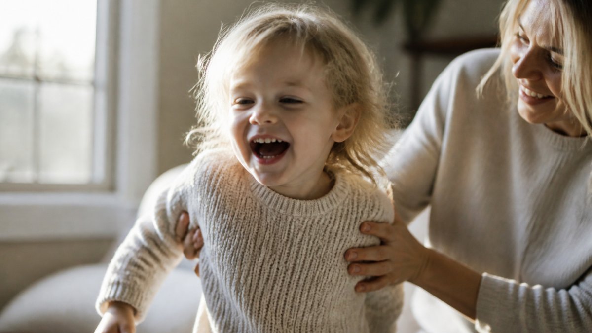
Natural poses for child portraits work best when you guide rather than direct. Children settle into real expressions when they have something to do. Give them a small task and the pose takes care of itself.
Try these cues:
- “Show me your best secret smile”
- “Look up at the ceiling like something is falling”
- “Give the gift a squeeze”
- Let them lie down and look up at the camera
- Ask for a serious face, then catch the laugh after
Eyes closed, looking away, and mid-laugh frames often become the favorites. They feel like the child, not a pose.
Posing by Age
The cue that works for a four-year-old will fall flat with a nine-year-old. A practical workflow adjusts the approach to the child in front of you.
- Under two: You are not posing a baby, you are posing the parent and waiting. Have a parent hold the child at the edge of the frame, then step back so only hands and a shoulder show. Catch the look between them.
- Two to four: Keep sessions short and let the child move. Sit them on a stool or a low step and give them a small object to inspect. Shoot in bursts and expect most frames to be motion blur.
- Five to eight: This age loves a job. Ask them to count something, hold a gift steady, or show you their “serious” face. The transition between prompts is often the real photo.
- Nine and up: Older children can hold a pose but may feel self-conscious. Give them a direction with a reason, “look toward the window like you are waiting for someone”, and let them interpret it.
Lighting and Camera Settings for Moving Children
Black-and-white portraits live or die on light, and children rarely hold still. Soft, directional window light is the most forgiving source: place the child at an angle to the window so one side of the face is lit and the other falls into gentle shadow. That contrast is what gives a monochrome portrait its shape.
On the camera side, a few settings matter more than the rest:
- Shutter speed: Keep it at 1/250 or faster for toddlers and 1/125 or faster for older children who can hold still. Motion blur is hard to fix later.
- Aperture: A mid-range aperture keeps the whole face sharp. Very wide apertures look lovely until one eye is soft.
- Focus: Use continuous autofocus and track the eye nearest the camera. For a moving child, burst mode is your friend.
- ISO: Raise it before you lower the shutter speed. A slightly grainy sharp frame beats a clean blurry one, and grain suits black and white.
A Short, Low-Stress Session Flow
A calm session follows a predictable arc. Start with a simple seated frame while the child is still settling in. Move to a standing or walking frame once they are warm. Save the playful prompts and the props for the middle, when energy is highest. End with a quiet frame, a look out the window or a hug with a parent, because the last few minutes often produce the softest expression.
For children who need more time to warm up, a low-pressure approach helps. Our women’s portraits sessions use the same gentle pacing.
Plan the session around the child’s energy, not the shot list. A short session with a few real expressions beats a long one full of posed smiles.
Choosing Photos for Holiday Cards
Choosing photos for holiday cards means picking for the card, not for the camera roll. The best card image is clear at a glance and holds up small.
A simple selection process:
- Narrow to 10 to 15 frames
- Cut anything with a distracting background
- Check the face at thumbnail size
- Pick one hero image and one backup
- Match the crop to your card template
| Card Goal | Best Photo Type | Why It Works |
|---|---|---|
| Classic and calm | Single child, soft light | Reads clearly at small size |
| Warm and playful | Mid-laugh or movement | Feels alive on the card |
| Formal greeting | Seated, hands folded | Suits a traditional layout |
| Family focus | Wider frame with parents | Shows connection |
Order prints at the largest size you can, then judge the face. If it reads well small, it will read well on the card.
How to Choose a Photographer for Classic Black and White Child Portraits
Choosing a photographer for classic black and white child portraits starts with the portfolio, not the price list. Look for monochrome work, not just color images converted later. The tone, contrast, and skin rendering should feel deliberate.
Ask three questions:
- Do you shoot with black and white in mind, or convert after?
- How do you handle a child who needs time to warm up?
- Can I see a full gallery, not just highlights?
Our editorial portraits show how we balance softness with subtle direction. That same approach carries into child and family sessions, including children who need a slower, more patient pace.
A common mistake is booking on price alone. A cheap session that yields no usable card image costs more than a thoughtful one that delivers.
For published work and background, see our magazine features. The Library of Congress on preserving family photographs offers useful guidance on storing prints for the long term.
Conclusion
Holiday cards come and go, but the portrait inside them can last for decades. A calm, well-lit black and white image of a child does more than fill a card. It becomes the photo families pull out years later.
At KRISTIE Montrois, we bring editorial care to every session. We balance softness with subtle direction, shoot with monochrome in mind, and give children the time they need to relax.
Ready to plan your holiday portraits? View our portfolio and start the conversation.
Frequently Asked Questions
What should children wear for black-and-white holiday card photos?
Choose simple textures and shapes that read well without color: knits, linen, wool coats, and solid tones. Avoid busy patterns and logos, which turn muddy in monochrome. Light and dark contrast helps separate your child from the background. Layers like a knitted hat or a soft coat add seasonal feel without needing color. Bring one or two options so you can see what photographs best.
How do you get natural expressions from children in portraits?
Skip the stiff ‘say cheese’ approach. Ask a question, tell a silly story, or let them move between frames. Candid moments like looking up, laughing, or a quiet in-between glance often make the strongest holiday card photo. Subtle direction works better than rigid posing, especially with young children. Give them a small task, like holding a wrapped gift, and let the expression follow.
Can a black-and-white portrait work for a holiday card?
Yes. Monochrome keeps the focus on faces and connection rather than seasonal colors, which is why these portraits feel classic year after year. Pair a black-and-white image with simple card typography and a clean layout. If you want a hint of holiday, add a small prop like a knitted hat or a string-tied gift in the frame. The result reads timeless rather than trendy.
How do you choose a black-and-white photo for a holiday card?
Start with expression and connection, not perfection. Choose the frame where your child looks most like themselves, then check that the crop works for your card size. Confirm the image is sharp and the contrast holds up when printed. If you are deciding between two, pick the one that still feels warm in monochrome. A great card photo is one you would happily frame.

0
comments
Leave a comment ⟶